
This is the September 2026 edition of the Mobile-Friendly Checker benchmarks. Every figure below comes only from scans run inside that month, and none of them will change again — a rate you quote today will still be at this address years from now. For every published month added together, go back to the tool's own page: that one is refreshed each time a month is added, and the figures here never are.
| Data period | 1 September 2026 – 30 September 2026 |
|---|---|
| Unique sites | 3,410 |
| Total scans | 3,686 |
| Benchmarks / tools | 1 — Mobile-Friendly Checker, one of the 25 tools in this edition |
| Minimum sample | at least 500 scans per tool in the month |
| Data frozen on | 2 October 2026 |
A monthly snapshot does not change after it is published: the figures on this page stay exactly as they were frozen on that date.
What changed since August 2026
The biggest check-level move was “Responsive images (srcset)”, which went from 53% in August 2026 to 62% in September 2026 — it went unmet in a larger share of this month’s sample.
Reading a monthly difference. Each month is a separate sample, and its size changes from month to month. A change in sample size can move a median and a distribution by itself, so a monthly difference should not be mistaken for a change in scores: it does not show that sites improved or got worse.
| Check | Not met then | Not met now | Change |
|---|---|---|---|
| Responsive images (srcset) | 53% | 62% | +9 pp |
| No fixed-width layout | 55% | 48% | −7 pp |
| initial-scale defined | 19% | 16% | −3 pp |
| Responsive CSS (media queries) | 31% | 32% | no change |
| Viewport meta tag | 11% | 12% | no change |
| Zoom not disabled (a11y) | 8% | 7% | no change |
| Charset declared | 5% | 6% | no change |
| width=device-width | 13% | 13% | no change |
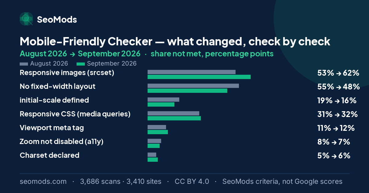
Moves under a point are marked as no change. The two months are independent samples of a shifting set of sites, and a difference that small is measurement noise.
See the full comparison across every tool, or this tool's complete series.
How the scores fell
This is how 3,686 scans spread across the five score bands in September 2026. Nearly everything piles into the top band — most sites in this sample meet this measure, so a high score here does not set a page apart.
- 0–19
- 20–39
- 40–59
- 60–79
- 80–100
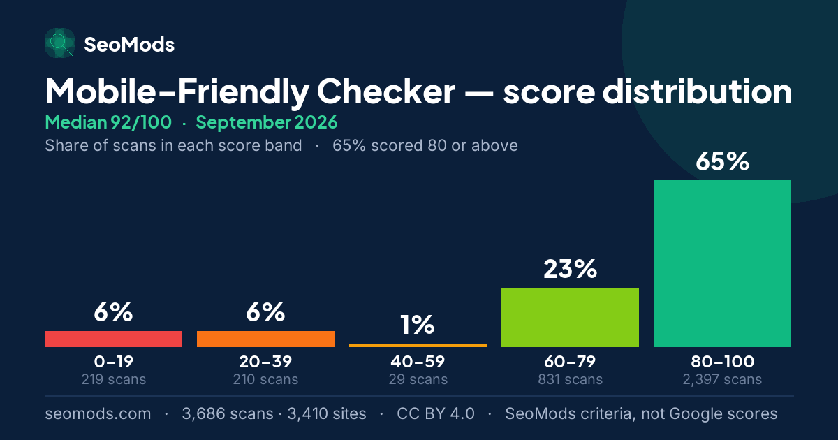
| Score band | Mobile-Friendly |
|---|---|
| 0–19 | 6% · 219 |
| 20–39 | 6% · 210 |
| 40–59 | 1% · 29 |
| 60–79 | 23% · 831 |
| 80–100 | 65% · 2,397 |
| Total runs | 3,686 |
Which SeoMods checks went unmet
The SeoMods checks that were not met in Mobile-Friendly Checker scans during September 2026. What each check means and what to do about it is on the tool's own benchmark page; this page is the record of the month.
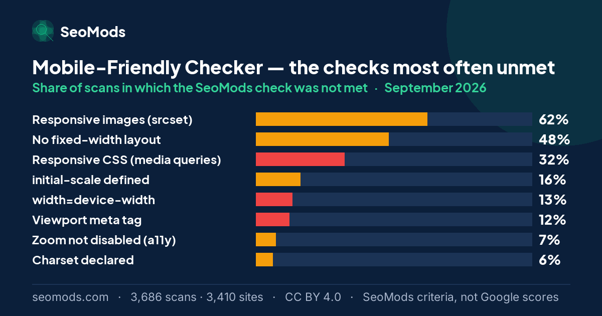
| Check | Not met (share of scans) | Weight |
|---|---|---|
| Responsive images (srcset) | 62% | Partial |
| No fixed-width layout | 48% | Partial |
| Responsive CSS (media queries) | 32% | Hard fail |
| initial-scale defined | 16% | Partial |
| width=device-width | 13% | Hard fail |
| Viewport meta tag | 12% | Hard fail |
| Zoom not disabled (a11y) | 7% | Partial |
| Charset declared | 6% | Partial |
The rate is the share of scans in which a SeoMods check was not met. It is SeoMods’ criterion, not Google’s assessment of these pages. “Hard fail” means the check’s full weight is deducted from the SeoMods score; “partial” means part of it.
The weakest areas that month
This month’s sample
In September 2026 the Mobile-Friendly Checker recorded 3,686 successful scans across 3,410 unique domains. Across the whole series that month there were 86,983 scans covering 22,549 sites.
How the sample is collected, how it is anonymized and where the method's limits lie govern the whole series, so they are set out once in the methodology on the hub.
| Tool | Domain endings in the sample |
|---|---|
| Mobile-Friendly | .com 45% · .org 9% · .uk 5% · .it 4% · other 38% |
What this score does not measure
- It is not Google’s official mobile usability assessment. It is a set of technical checks on the HTML.
- It does not measure the experience on a real device. Tap targets, text size and content that overflows the screen need a test in an actual browser on an actual phone.
- It is not a Google ranking. A high score does not guarantee a better position, and a low one does not mean Google has penalised the page.
About this benchmark. This benchmark is calculated from data on the sites SeoMods has scanned. The results do not necessarily represent all websites, or a random selection of them. The scores express SeoMods’ own measurement and scoring criteria; they are not ranking, quality, E-E-A-T or AI visibility scores issued by Google. Sample, anonymization and licence: the full methodology.
Frequently asked questions
What was the median Mobile-Friendly Checker score in September 2026?
In September 2026 the median was 92/100 and the mean was 78.6. 65% of scans reached 80 or above. These figures are frozen and will not change.
Which SeoMods check went unmet most often in September 2026?
“Responsive images (srcset)”, which was not met in 62% of scans, followed by “No fixed-width layout” at 48%.
Does this page ever change?
Its figures do not. A dated record is only useful if it stays put: someone citing the September 2026 figures today has to find the same numbers at the same URL years from now. The one thing added afterwards is a pointer to the next month's edition once that is published — the data is left exactly as it was. For every published month added together, see this tool's own benchmark page, which is refreshed each time a month is added.
Citing this edition
The figures on this page are free to reuse under CC BY 4.0. Suggested citation: SeoMods — Mobile-Friendly Checker benchmarks, September 2026 edition, https://seomods.com/seo-score-benchmarks/mobile-friendly/september-2026.