
This page is about one tool’s data: the Mobile-Friendly Checker. For how these scores sit alongside the other measures, the distributions in full and the methodology, see SEO Score Benchmarks.
Which mobile check goes unmet, and how often
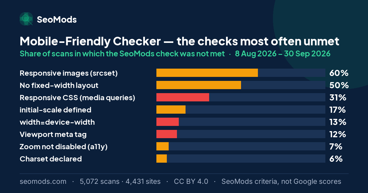
The tool takes a URL and runs eight checks: the viewport tag and the two values inside it, whether zoom is blocked, responsive CSS, responsive images, fixed-width layout and the charset declaration. The page is not opened in a browser or on a real device; the checks are made on the HTML. The percentage below is the share of runs in which the SeoMods check was not met.
| Check | Not met (share of scans) | Weight |
|---|---|---|
| Responsive images (srcset) | 60% | Partial |
| No fixed-width layout | 50% | Partial |
| Responsive CSS (media queries) | 31% | Hard fail |
| initial-scale defined | 17% | Partial |
| width=device-width | 13% | Hard fail |
| Viewport meta tag | 12% | Hard fail |
| Zoom not disabled (a11y) | 7% | Partial |
| Charset declared | 6% | Partial |
The rate is the share of scans in which a SeoMods check was not met. It is SeoMods’ criterion, not Google’s assessment of these pages. “Hard fail” means the check’s full weight is deducted from the SeoMods score; “partial” means part of it.
The top and bottom halves of the table tell two different stories. The two items at the top — a fixed-width layout in 50% of runs and no responsive images in 60% — are the most common, and SeoMods scores both as partial credit lost. The 3 checks scored as hard fails are rarer; when they go unmet the page is likely not to scale properly on a small screen. The average scan passes 6.0 of the eight checks.
The threshold inside the score
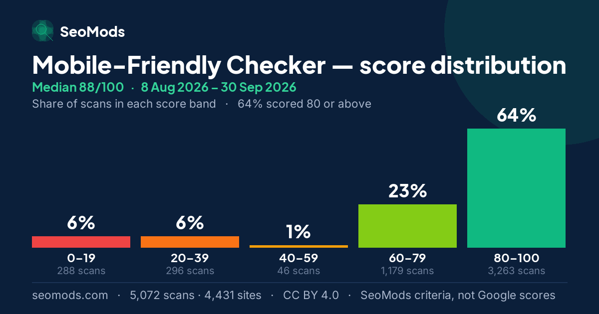
What separates this measure from the others is the shape of its distribution. The 25th percentile is 78 and the 10th is 26 — 52 points apart. 64% of scans collect at 80 and above, 12% drop below 40, and only 1% sit in the 40–59 band between them. The grade mix says the same: 2,323 scans graded A and 602 graded F, with just 87 in the D band in between.
The gap is a property of the scoring. The viewport meta tag and the width=device-width value inside it carry half the available points between them — and both live in the same single line:
<meta name="viewport" content="width=device-width, initial-scale=1">
If a page has that line, three checks are met at once; if it does not, three go unmet at once. That is where the hole in the distribution comes from. The numbers line up too: the viewport tag is missing in 12% of runs and width=device-width in 13% — against 12% of scans falling below 40. The practical consequence is that on a page scoring low here this line is the first place to look; adding it raises the SeoMods score markedly.
A technical check is not the real user experience
Having a viewport tag and a width=device-width value does not mean a page is fully mobile-friendly. This check carries a high weight in the SeoMods mobile score, but on its own it does not represent the experience on a real device or every mobile usability problem. A page with a correct tag can still have tap targets that are too small, text too small to read or content that overflows the screen; those only show when the page is opened on a real device or in a browser, and this tool does not open it.
Nor is the SeoMods mobile score Google’s official mobile usability score. It is eight technical checks added up with weights SeoMods chose; it says nothing directly about how a page fares in mobile search or about what real users experience on a phone.
The category ranking looks at first like it contradicts that: Responsive Layout is the weakest category in 82% of runs against only 12% for Viewport & Scaling. It is not a contradiction. Pages without a viewport tag are the minority; on pages that have it, the SeoMods checks most often unmet are the ones about layout.
What is left on pages that have a viewport
On the pages above the threshold — the large majority of the sample — the same two checks go unmet most often. A fixed-width layout is still present in 50% of runs: usually an old table, a fixed-size image, or a width="960" left behind by a template. Responsive images are missing in 60%. The second does not break the layout, but it can mean a phone downloading desktop-sized images; the effect shows in speed and data use rather than in layout.
One item sits at the bottom of the list but deserves separate mention: zoom is blocked for the user in 7% of runs. That is not an SEO problem, it is an accessibility one: user-scalable=no, added to stop a layout breaking, also stops a reader with low vision enlarging the text. If the layout is already responsive, the line is not needed.
Test a page for mobile-friendliness
Where does my score sit?
A score from the Mobile-Friendly Checker can be read against the five values below. All of them are calculated from the scans in this benchmark: they place a SeoMods score within this sample, not in Google’s results.
| Percentile | Score | What it means for a score |
|---|---|---|
| P10 | 26 | About one scan in ten scored 26 or lower. Below it, a page is in the lowest tenth of this sample. |
| P25 | 78 | The edge of the bottom quarter. A score under 78 is below about three quarters of the scans. |
| Median | 88 | The middle of the sample: half the scans scored lower, half higher. A score of 88 is the typical result here. |
| P75 | 92 | Where the top quarter begins. A score of 92 or more is at or above about three quarters of the scans. |
| P90 | 92 | Where the top tenth begins. A score of 92 or more is among the highest 10% of scans in this sample. |
Some of these values coincide. That happens when many scans land on exactly the same score, so the bands between them are not separate bands at all — read the equal values as one step.
Percentiles describe the sites SeoMods scanned, not the whole web, and they apply to this tool only: the same number on another tool sits somewhere else.
The charts
The charts below carry this page’s figures in a form that can leave it: each one states the tool, the period and the sample on the image itself. They are free to reuse under CC BY 4.0 with a link back to this page.
Month by month
This page adds every published month together. Underneath it, each month is frozen as an edition of its own whose figures are never edited again — which is the only reason two months can be set side by side at all. Below is the Mobile-Friendly Checker across the 2 published editions, with the combined figure in the last row of the table.
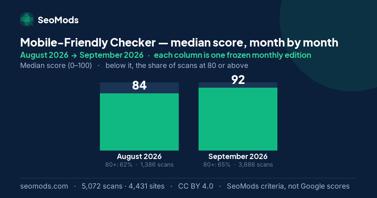
Between August 2026 and September 2026 the median went from 84 to 92, and the share of scans at 80 or above went from 62% to 65%. The two months do not measure the same sites — the September 2026 sample has about 3 times as many sites — so read the gap as a change in the cross-section measured, not as the same sites getting better or worse.
| Edition | Median | vs. previous | Scored 80+ | Issues/run | Runs |
|---|---|---|---|---|---|
| August 2026 | 84 | baseline | 62% | 2.0 | 1,386 |
| September 2026 | 92 | +8 pts | 65% | 2.0 | 3,686 |
| All published months, combined | 88 | — | 64% | 2.0 | 5,072 |
Reading a monthly difference. Each month is a separate sample, and its size changes from month to month. A change in sample size can move a median and a distribution by itself, so a monthly difference should not be mistaken for a change in scores: it does not show that sites improved or got worse.
Which checks moved
Each check’s rate in the first edition that measured it, beside its rate in the latest. Moves under two points are marked as no change: these are independent monthly samples of a shifting set of sites, and a difference that small is not evidence that anything on the web changed.
| Check | Not met in August 2026 | Not met in September 2026 | Change |
|---|---|---|---|
| Responsive images (srcset) | 53% · August 2026 | 62% · September 2026 | +9 pp |
| No fixed-width layout | 55% · August 2026 | 48% · September 2026 | −7 pp |
| initial-scale defined | 19% · August 2026 | 16% · September 2026 | −3 pp |
| Responsive CSS (media queries) Hard fail | 31% · August 2026 | 32% · September 2026 | no change |
| Viewport meta tag Hard fail | 11% · August 2026 | 12% · September 2026 | no change |
| Zoom not disabled (a11y) | 8% · August 2026 | 7% · September 2026 | no change |
| Charset declared | 5% · August 2026 | 6% · September 2026 | no change |
| width=device-width Hard fail | 13% · August 2026 | 13% · September 2026 | no change |
What this score does not measure
- It is not Google’s official mobile usability assessment. It is a set of technical checks on the HTML.
- It does not measure the experience on a real device. Tap targets, text size and content that overflows the screen need a test in an actual browser on an actual phone.
- It is not a Google ranking. A high score does not guarantee a better position, and a low one does not mean Google has penalised the page.
About this benchmark. This benchmark is calculated from data on the sites SeoMods has scanned. The results do not necessarily represent all websites, or a random selection of them. The scores express SeoMods’ own measurement and scoring criteria; they are not ranking, quality, E-E-A-T or AI visibility scores issued by Google. Sample, anonymization and licence: the full methodology.
Frequently asked questions
What is a good mobile-friendly score?
In this dataset the median is 88/100 and 64% of scans reach 80 or above. But on this measure the number matters less than which side of the split you are on: the 25th percentile is 78 while the 10th is 26. There is very little between 78 and 26. A low score usually indicates that the viewport tag is absent. A high score, though, does not prove the page is trouble-free on every device: it measures technical checks on the HTML, not the experience on a real device.
Why is the gap between the 10th and 25th percentile so large?
Because half the SeoMods mobile score depends on a single line of HTML. The viewport meta tag and the width=device-width value inside it carry half the available points between them — and both live in the same tag. If a page has that tag, both are met; if it does not, neither is. That is why 12% of scans (584 runs) drop below 40 while the rest collect above 60. It is a product of the scoring: the check carries a high weight in the SeoMods mobile score, but on its own it does not represent the experience on a real device or every mobile usability problem.
Does a missing srcset make a page not mobile-friendly?
No — SeoMods scores it as partial credit lost, not a hard fail. The layout does not break because of it; the problem is that images are downloaded larger than they need to be. It is one of the most common gaps on the list all the same, with no srcset in 60% of runs. The effect shows up in data usage and load time rather than in layout, which is why it is really paid for on the speed side.
Is it harmful to stop users zooming?
For accessibility, yes; it happens in 7% of runs in this sample. Adding user-scalable=no or maximum-scale=1 has been a designer’s shortcut for years to stop a layout breaking under zoom; the cost is that readers with low vision cannot enlarge the text. There is also no longer a reason for it: if the layout is genuinely responsive, disabling zoom buys nothing.